
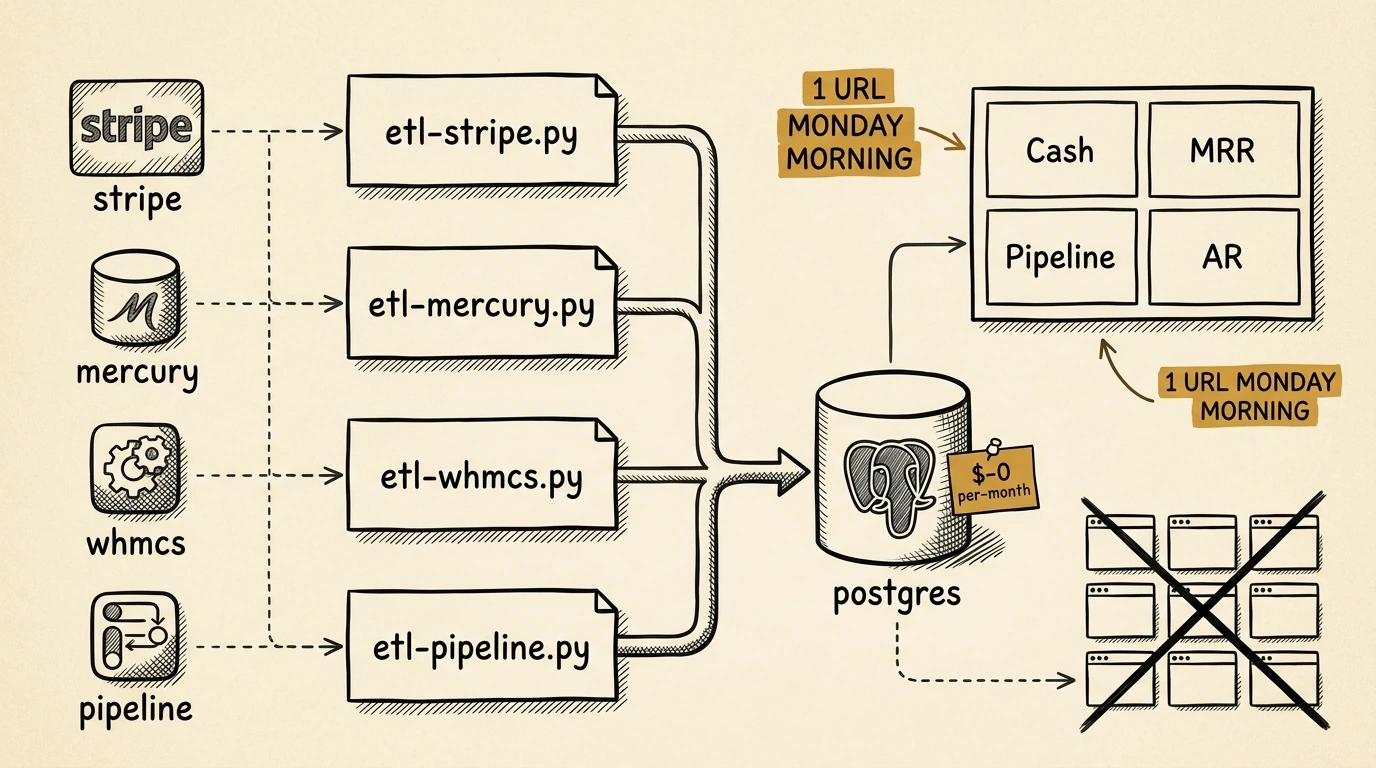
The layer above the bookkeeping pipeline: Grafana, Postgres and a dormant server I was already paying for.
Every Monday morning, I used to open seven browser tabs to figure out how my business was doing. Stripe for the week’s payments. Mercury for the bank balance. WHMCS for active subscriptions and overdue invoices. A spreadsheet for the sales pipeline. QuickBooks for cash position. Coinbase for crypto P&L. A Google Sheet for whatever I’d forgotten was in there.
Each tab held a fragment of the truth. None of them held the truth.
After fixing the bookkeeping pipeline last quarter, I had clean data sitting in Postgres and a handful of working API integrations. The dashboard was the obvious next layer. The bookkeeping work was about catching up on what already happened. The dashboard would be about running the business: every Monday, in 30 seconds.
What a CEO dashboard actually needs to show
Most “CEO dashboard” SaaS products are designed for investor-readiness or board reporting. Clean charts for a slide deck. That’s a real product, and it answers a board’s questions. The owner-operator question is different:
“Did anything change last week that I need to react to?”
Answering that in ten seconds requires four or five categories on one screen:
- → Cash position right now. Mercury bank balance, today, as one number.
- → Revenue trend. Last 30 / 90 / 365 days, weekly cadence. The shape matters more than the level.
- → Subscription health. Active count, churn this month, MRR delta vs. prior month. Three numbers.
- → Pipeline forecast. Open opportunities weighted by stage probability, with expected close dates.
- → AR exposure. Overdue invoices > 30 days, sorted worst-first, by client.
Most dashboard posts just list panels. The question worth asking of each panel is which operating decision it supports. The cash panel decides whether I take on a new server-provisioning contract this week. The pipeline panel decides whether to spend the week on outreach or delivery. The AR panel decides whether to send a friendly nudge today or wait. If a panel doesn’t change a decision, it shouldn’t be on the screen.
The build
Three layers. None of them are exotic. The interesting choices are about what to leave out.
ETL layer
A handful of small Python scripts, one per data source:
etl-stripe.py     # daily Stripe revenue + fees + payout reconciliation
etl-mercury.py    # daily Mercury bank balance + transactions
etl-whmcs.py      # daily WHMCS subscriptions, MRR, overdue invoices
etl-pipeline.py   # daily sales pipeline snapshot from local CRM
I’d already done the heavy lifting on the Stripe and WHMCS integrations during the bookkeeping project. This ETL layer is mostly glue code: pull data, transform, write to Postgres, log, exit. Each runs as a systemd timer at 06:00 UTC server-side, except the pipeline one which runs locally on launchd because the CRM data lives on my laptop.
If something fails, the script logs and exits. The dashboard shows the stale data under a clear “last updated” timestamp. Fail loud, fail visible.
Storage: Postgres on a server I already had
The data layer lives on a single UpCloud box I was already paying for as a backstop for something unrelated. CPU rarely tops 5%; memory hovers around 600 MB.
Tables are split between time-series-shaped data (revenue, balance, subscription counts indexed by date) and a few normalized tables for pipeline state. A nightly cron ships Postgres dumps to S3 so the data layer has a recovery story.
Visualization: Grafana, dashboards as code
This is the pivot point: Grafana, configured by Python scripts that live in a Git repo.
Each dashboard is defined by a wire-*.py file that POSTs the dashboard JSON to Grafana’s API. Re-running the script overwrites the dashboard deterministically. Diff-able, replicable, version-controlled.
When I want to add a panel, I edit Python and re-run the wire script. When I want to know why a threshold is set to 80%, I git blame. The Grafana UI is only a viewer, so I can rebuild the dashboard from scratch in five minutes if Grafana ever falls over, and roll back a bad change with git revert.
What I see now that I couldn’t before
The payoff is behavioral. Five real operating decisions the dashboard has changed:
1. Cash runway visibility. I now know my bank balance trend without opening Mercury. When I was deciding whether to take on a new server provisioning contract last month, I checked the dashboard, not the bank app. The decision happened in 30 seconds instead of “let me get back to you.”
2. Subscription churn surfaced early. I noticed two cancellations in the same week and dug into them — both were related to a single underlying issue with one of our auto-update plugins. I fixed it the same day. Without the dashboard I would have caught the pattern two billing cycles later, manually, after losing more accounts to the same root cause.
3. Pipeline weighted forecast. I can see expected revenue 30 days out, weighted by stage probability. That tells me whether it’s a “be aggressive on outreach” week or a “focus on delivery” week. The forecast is rough, but rough-and-current beats precise-and-stale every time.
4. Overdue invoices surfaced, not buried. The AR aging panel is sorted worst-first. Last month I sent a friendly nudge to a client with 60 days outstanding before it became an awkward 90-day conversation. The note was light because it was early. Late notes are not light.
5. One screen, every Monday. The seven-tab routine is gone. I open one URL, scan once, and know whether the week needs anything different from me. Most weeks the answer is “no.” It tells me whether I need to do anything at all.
The operational sequel
The same metrics platform now runs three more dashboards aimed at our hosting fleet rather than the business itself: a Fleet Overview (per-site resource attribution, Redis cache health), a Backup Health board (every site’s last successful backup, plus off-site retention status), and a Mail Health board (per-server delivery, DMARC pass rates).
Different audience, same building blocks. The dormant server now runs the entire observability stack for both the business and the infrastructure.
What I learned
1. Off-the-shelf “CEO dashboard” SaaS products solve the wrong problem. They optimize for investor reporting: clean charts for board decks. The owner-operator question is “did something change last week,” and that needs a different shape than “what should I show my LP.”
2. The data layer is the hard part. The dashboard is the easy part. Building reliable Stripe → Postgres / WHMCS → Postgres / Mercury → Postgres pipelines took most of the time. Once the data was clean and current, wiring up Grafana panels was an afternoon.
3. Dashboards as code beats clicking around. Every panel is a committed file. When I want to know why I set a threshold, I git blame. When I want to add a panel, I edit Python. The UI is only a viewer.
I run WebOps Hosting, Lucky Tyke and Osita from Binghamton, New York. The dashboards in this post run on Grafana and Postgres on a single UpCloud VM.